Go over basic terms and provide a base level walkthrough of the Website Builder feature including adding a Navigation item and navigating the Theme settings.
From the dashboard, select the Website Builder in your menu, then you will see the editing panel on the left, and your website mock-up screen on the right. If you reference a Feature that does not have any components or information uploaded to the Dashboard it will display empty and notify you that the Feature has nothing to reference, and point you to where in the Dashboard you can upload your content.
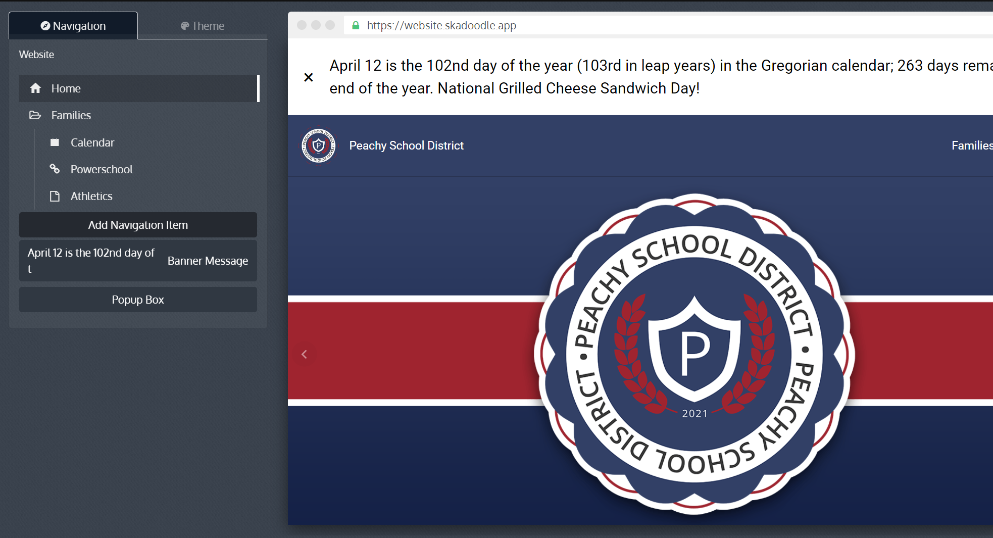
Navigation Items
On the left side editing panel, there are two tabs. The Navigation tab will show you which pages are included in your website and drop-down menu navigation. You can add a navigation item from this page. The Theme tab allows you to set design elements of your website such as colors, fonts, and button looks.
You can build pages, set up drop-downs menus, and add links, by click on the Add Navigation Item button.
There are four types: Page, Dropdown and Link and Quicklinks
Page
Build a new page for your website, this includes the title, and the optional check box to show it in navigation bar or in the website footer. For any navigation items, hover to show the setting icon to edit/duplicate/delete it, or the drag icon to reorder. Note that home page is default and cannot be deleted.
Blank Page
A blank page allows you to create an empty page to add any content setions. This page allows maximum flexibility in page creation.
Feature Page
The pre-designed and loaded full page solely focused on the feature in question. Note that you can’t edit feature page, nor can you preview it in the mock-up screen. You can only preview a feature page in a preview browser tab. Options and benefits include:
Calendars
this provides users the ability to search only for specific calendars.
Documents
A documents page allows you to have all documents shared in our system sorted by folders.
Newsfeed
A newsfeed page allows you to sort by categories of interest, rather than seeing all news.
Pictures
The pictures page allows you to share multiple photo albums, rather than selecting just one.
Tip Line
This one explains itself, it just allows the form to use all the property on the page.
Dropdown
Create a dropdown, then select any page/link to be included in this dropdown item. You can always add more by clicking on the setting icon next to a dropdown.
Link
Add a link to frequently used websites, like your student information system or learning management system. Can be external/internal url from the Website Builder tool itself.
QuickLink
This creates a link similar in function to the "Link" option but it references specific links already created in the QuickLinks feature of your Dashbaord.
Banner Message
This option delivers important messages to your website visitors. If enabled, banner will appear on top of your site, and pop-up box explains itself.
Theme Setting
Theme Color & Accent Color
You can set 2 colors, theme color for major elements and accent color for buttons and other smaller features.
If you already have set colors for your app, simply use “Reset to app color” to match those.
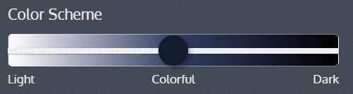
Color scheme
lets you choose from light (whiter background), color and dark (black background), but you will have the ability to override background color on the section level.
Fonts
You can set 2 fonts, primary font for header/section titles/section group titles, and secondary font for paragraph and all others. Again, you will be able to override on the section level, or use your custom font.
To use custom font, paste the font html code into the “custom code in <head>” test box on the bottom of the theme settings, then toggle on the “custom mode”, then type the font name in the font box like you would search for an existing font.
Simply pick from a list of available look for your buttons, which color follows the accent color that you set above.
Sections
Home page and any blank page on the website can be filled up by sections. There are three types of sections: default, website + app sections, and website sections. With each of these options, you can add a title, adjust the layout and alignment, and change the color of the background based your theme color. To add a section, hover on any section on the mock-up browser on the right of your dashboard, a blue border will appear for you to add a section above or below.
When you have selected a certain section and ready to edit it, the border will turn green.
Default Sections
These sections always show on every page of your website.
The header includes your logo, school name, and an optional secondary title, and navigation bar. You can choose from different layout options, like left or centered. The “transparent” checkbox is a good choice if you have a video which you want to be a background of header section. Font will follow theme settings but can also be overridden.
The footer includes elements like a paragraph in which you can embed a google map, a sitemap, a list of schools if you’re a district, and social media link buttons auto generated if you have set it up in your site profile.
App + Website Sections
App + Website sections are core content that can be shared across our platform, being used in both your mobile app and your website. To change the content of these sections, you have to leave the website builder and go to the corresponding feature page on our dashboard.
Slideshow
A slide show allows you to add the same photos being shared in the Slideshow Builder. If you choose to edit the content, simply clicking the link will take you to the Slideshow Builder to make any edits. You can add CTA button to this section, and point it to either a page, a web link, or even the phone number and email.
News
The news is a quick and easy way to share the latest information. Here you are able to limit the number of items that appear and you may also filter by categories.
Directory
The directory section is just that: it pulls key contacts from your school You may limit the number of contacts you chose to show on the page. You can also draw from a specific folder. Most Importantly, you have the ability to hide information that you may not choose to be public.
Info Pages
Info pages contain content that is specific to the school. This is shared content from the app, which means it only needs to be updated once!
Calendar
This populates content from the "Events" feature within the Dashboard, auto-populating the Calendars you choose.
Upcoming Events
Highlight a few upcoming events, an alternative section if you do not want a full calendar section on your homepage
Documents
With the documents section on the website, you can share key documents from a folder. You are allowed to have an item limit, with the ability to share more.
Pictures
When adding pictures to the website, you can draw from any folder of pictures you may have. When adding pictures, you can limit how many are visible. You can also include a show more button that allows website visitors to go to the full folder.
Quick Links
This communicates with the Quick Links items in the Dashboard. You can reference individual items or entire Quick Links folders.
Tip Line
The Tip Line is a form that can be added to your website to report bullying, campus safety, academic integrity, or other concerns to the appropriate school authority. They may be submitted anonymously for those uncomfortable sharing their information.
Daily Message
The daily message allows you to put out a message every day to your community. This message can be added in the calendar to make sure important announcements are being shared with your community.
Supply Lists
This communicates through currently setup Supply lists, if you do not have one created this field will show empty in the previewer.
Site Selector
Creates a row of buttons showing all Schools for your District.
Website Sections
Website sections are used only within the Website builder. The content of these section is editable inside the website builder.
Embed code
Embed code allows you to embed content from any third-party website, as long as it’s an embeddable html code or iframe.
Hover Boxes
Hover Boxes are a great way to add a dynamic look and feel to your website. You can add a picture with text, and choose from a variety of animation effects. Normally the font family and size will follow the theme setting, but you can also override the headlines.
CTA button: add buttons to each hover boxes. These buttons will be the secondary button design, but they work the same as primary buttons. Example: “learn more” button that points to a subpage.
Content
Similar to Hover Boxes, Content is another way to add images to your site with descriptive text, but without the hover box options. Like hover box section, headlines font family and size are overridable. You can also add CTA buttons in the same manner as you would with the hover box section.
Examples of use: Showcase areas of pride for your school, or a motto. These are simple ways of adding needed content to your page.
Columns
The Split allows you to add multiple sections in the same row of the website. If a user is viewing the website on a mobile device, the screen will revert to a single column for optimized viewing.
Examples of use: You may want a slide show, with the news next to the slides. The Split allows you to change the look and feel of the site a bit.
Video
You are able to include video on your website with additional options not included in the embed feature. This includes layout, alignment, and theme functionality as well as the option to start automatically, show the video controls, run on repeat, or mute the sound.
Examples of use: If your school has a showcase video, you can add it to your homepage header. You may also want to have video on a variety of your sub-pages with more control than offered with the embedding feature.
Navigated Info Page
Allows you to create Info Pages that od not communicate with the Info Page feature, keeping them entirely separate within the Website Builder. You can format navigation or anything else you can do with the existing Info Page feature here.
Custom Text
Works the same way as “info page” in app but specifically for your website. You can enter any text with a rich editor, with options like adding media, hyperlinks, bullet points, or change color of the text, etc..
Paste
If you chose to "Copy" a Website Builder item earlier in your creation you can use the Paste function to perform the standard Paste function
Website admin control
On top of the builder, you will see a panel of admin controls.
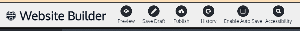
Preview
You can see a live preview of the saved draft of your website.
Save Draft
Save a draft of your current edits. It will notify you if other users are editing the Website Builder at the same time. It is best practice to ensure only one editor is in the Website Builder at the same time to avoid saving over each other's work.
Publish
Publish the current draft to your live url. Before this, you need to set up the domain with our customer success team, if not already done.
History
You can see a list of your published versions with time stamps. You can publish, edit, or delete them. This is a great feature to prevent losing your edits if something funky happens!
This enables saving the Website Builder every 5 minutes before leaving the Website Builder page in the Dashboard. Just in case you forget to save your Draft.