New Theme Builder
Objective
To go provide a walkthrough of the updated theme builder settings and which fields affect which areas within your App
Important Note: The "New theme builder" is only for v10 apps, and nothing done in old theme builder will affect the v10 app. There is an exception. If you change the primary color in the new theme builder and you save it, that will change the main color in the old theme builder, for any v6 apps.
Colors
This is where you choose your App's color scheme.
Primary
For example, the Light Blue at the top and bottom of this App are the Primary Color
If I edited this to a bright red, here's how that would present within the App:

Icon Background
This is set to Transparent/None as shown below by default.
When I change the Icon Background to the color grey as shown below, look how it effects the App:
Original/Default Icon Background VS Grey Icon Background
Settings
This is where you can edit the layout and the font of your App.
Home Type
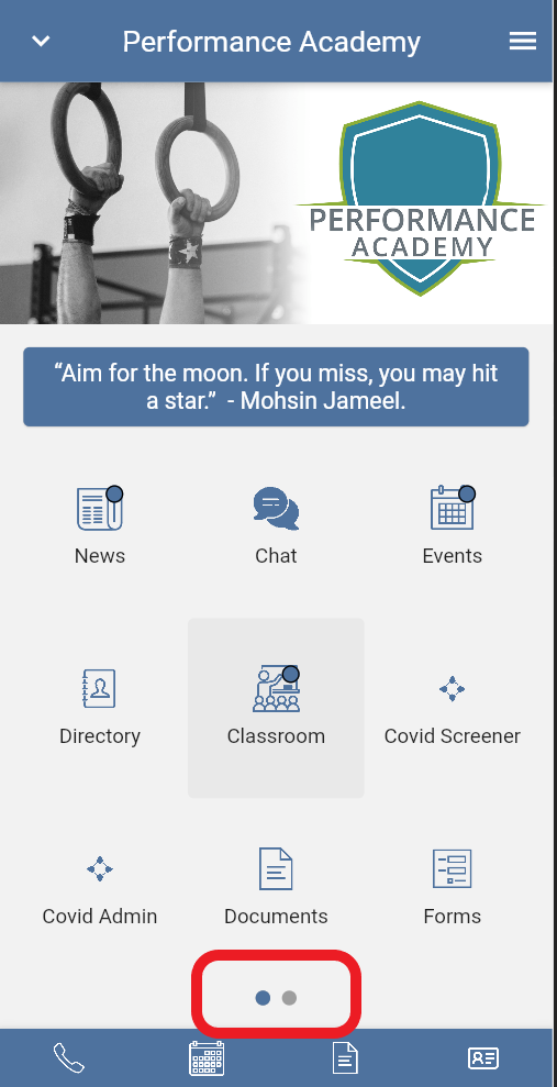
This edits your App layout and is set to "Grid Menu Horizontal" by default.
If you click the drop down you will see the other options:
Here's how "Grid Menu Horizontal" presents in the App:
Notice the 2 dots at the bottom of the App indicating you will need to swipe horizontally to see the next page.

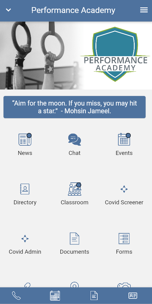
Here's how "Grid Menu Vertical" presents in the App:
Here's how "Grid Menu Vertical" presents in the App:
Notice how the 2 dots disappear. You can swipe vertically to see the entire App.

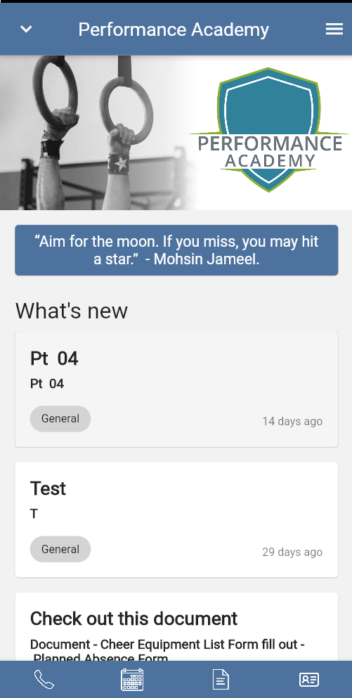
Here's how "Highlights" presents in the App:
Notice how this removes the Grid Menu entirely and creates a reel of highlights. This generates from items in the Newsfeed.

Font Family
If you type in the font you are looking for you can edit it here.
Multi-Color Icons
There is now a new checkbox in the new theme builder “Use multi-color icons”. If this is checked, the icons uploaded will not have any tint so the icon will be unchanged from whatever is uploaded. This will allow for multicolor icons like below. For consistency in app appearance, we recommend if enabling multi-color icons, you chose multi-color icons across the entire app so there isn't a mix of wire-frame, and multi-color.
Related Articles
Website Builder (Overview)
Objective Go over basic terms and provide a base level walkthrough of the Website Builder feature including adding a Navigation item and navigating the Theme settings. From the dashboard, select the Website Builder in your menu, then you will see the ...Editing an Icon Color
Objective Provide guidance for how to edit the Library icon colors Click on the item in the menu & Click “Library” under the icon To use an icon in our system view the “Image Library” Click on the desired icon Use the colored bar on the right of the ...How to use the Menu Builder in the App Builder
Objective: Learn How to use the Menu Builder in the App Builder Create a Button in the App In the Dashboard, navigate to the App Builder Hover on the header and click “+” button. Click “New Item” on the item underneath the header On the right hand ...Slideshow Builder
Objective: To learn how to add a Slideshow header to the Application Add New Slideshow Image Click "App Builder Click "Slideshow Builder" Tab Click "Add" The image must be between 1536 x 672 px and 3120 x 1560 px Click the green "+" and navigate to ...Creating a New Conversation on the Dashboard
From the Dashboard Home menu, select "Conversations" and then click "+New" Then title the conversation and select the participants (If you do not see the name of the participant you are looking for search for their name in the search bar) Click ...